“You have a pair of pants. In the left pocket, you have $100. You take $1 out of the left pocket and put in the right pocket. You now have $101. There is no diminution of dollars in your left pocket. That is one magic pair of pants.”

FASTgraphs as a Valuation Tool – Part 3

Posted by BM on May 28, 2021 

Reviewing historical information is a good way to see how a stock has performed over time but critics of this approach in valuation will often accuse you of looking backward. They have a point, so FASTgraphs has added an ‘Estimates’ tab to its arsenal. Before I buy, sell or hold a stock I want some expectation of what the return in the future might look like. We simply do not buy a stock and hope for a return. With FASTgraphs we have five ways to view the future thanks to the Analysts who follow the stock. I will use the ‘Normal Multiple’ approach.

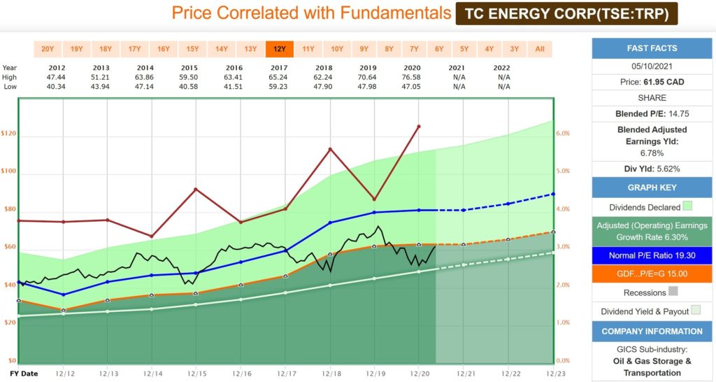
TRP has traded at a ‘Normal Multiple’ over the past five years of 16.84 (P/E). We will use that multiple combined with the Analyst’s (19 of them) estimated earnings and dividend growth to arrive at a reasonable expectation of return. We are also only going to use the information out to the end of 2022 as after that the number of Analysts providing estimates drops off quickly.

The ‘Black Line’ is the price line and shows the stock price going back to the beginning of 2020 until now. The dotted black line represents a projection of the stock price at the end of 2022. The box on the right side of the graph shows the data that helps you decide. The data shows you the projected stock price ($73.80) and how much of your return is made up from capital appreciation and the dividend paid. Over the next year and a half Analysts predict you will make ~17% total annualized rate of return (ROR) on a purchase at today’s price. This projection assumes that the Analysts are correct in their earnings estimates and that the stock trades at its normal multiple at the end of 2022. We can always do projections both assuming a higher P/E and a lower P/E than the norm to see a range of results. We call this our valuation corridor.

Source: FASTgraphs

Another nice feature of the FASTgraphs tool is it’s ‘Analyst Scorecard’ feature. What you are trying to determine here, is how accurate have Analysts been with their past projections.

If you scroll across the ‘2-yr Forward’ row you will see the past predictions of Analysts and right below the ‘Actual’ earnings numbers. Over the last five years, the Analysts have underestimated Actual earnings every time. Their summarized historical record can be found in the ‘Summary’ tab on this Analyst Scorecard view. Actual earnings have either hit or beat Analysts two-year projections 83% of the time over the last twelve years (assuming a 20% margin of error). Their record recently has been much better. This should give you a comfort feeling when it comes to trusting the Analysts who cover TRP as they have recently been conservative in their projections tending to underestimate as opposed to overestimate earnings (Difference % row).

Source: FASTgraphs

Forecasting is not an exact science but with a little research you can set reasonable expectations of what the future may look like.

This ends our three-part series on the FASTgraphs tool. Although we do not use FASTgraphs exclusively to make our investment decisions it certainly helps you feel comfortable when you do decide on an action (buy, sell, hold).

FASTgraphs as a Valuation Tool – Part 2

Posted by BM on May 25, 2021 

Once we identify that a company is worth digging into deeper, we use FASTgraphs to look at a few dividend performance metrics. The image below is for the previous ten years and we can see that TRP has had an average annual dividend growth rate of 7.3% and a consistent payout ratio in the 75% range. We can also see that TRP has generated over $6000 (on a 10K investment) in income alone. TRP looks like a great income stock with a safe and growing dividend but what about capital growth?

TRP Performance
Source: FASTgraphs

If we take a little closer look at the metrics, we notice that TRP’s annualized Rate of Return (ROR) was 8%. Notice that only 4.6% of that return came from capital growth with the rest coming from the dividend and its growth. With a starting yield of 4.4% and dividend growth of 7.3% you would expect a ROR of close to 12%.

If you look at the Price Chart below (found in Part 1 of this series) you will see that TRP was valued at ~19 P/E in 2012 (near the Blue Line) where today it is close to the Orange Line with a P/E of 15. Had TRP been valued in 2012 at a P/E of 15 then our annualized ROR would be almost 4% higher (50% more). The change in P/E was responsible for the sub-par capital growth.

TRP was overvalued in 2012 and thus future capital/price returns were less going forward. The numbers unravel the mystery.

TRP FastGraphs
Source: FASTgraphs

From the information we have so far, we are getting a clearer picture of when TRP is fairly-valued. We also know the impact on our future returns if we purchase TRP when it is over-valued.

In Part 3 of this series we will use FASTgraphs to estimate future earnings, dividends and their growth rates to see if the future will be the same or better than the past.

FASTgraphs as a Valuation Tool – Part 1

Posted by BM on May 10, 2021 

I have written three articles on value indicators over the past month, and each have their merits when it comes to screening for fairly valued dividend growth stocks. I will now use a tool that combines all of these indicators into one graphical representation of valuation. That tool is the Fundamental Analysis Software Tool (FASTgraphs).

One of my mentors, Chuck Carnevale, is the inventor of this tool and I highly recommend a subscription to any serious investor. In this article, I will use FASTgraphs to quickly screen for fairly valued stocks on ‘The List’ so that we can take a deeper look into fundamentals.

We use earnings yield as our initial screen. Earnings yield is the annual earnings of a stock, individual company, or market index compared to the price. Earnings Yield = Annual Earnings Per Share / Stock Price. Another way to think of it is that for every dollar you invest in a stock you would expect to get a return equal to the earnings yield. Earnings yield is good for evaluating potential returns across companies with similar characteristics (dividend growth companies) and other forms of investments. For example, a bond paying 6% would be similar to a stock with an earnings yield of 6% at the time of purchase.

Our screen at the time of writing this article brings up seven companies with an earnings yield of at least 6.5% which we will set as the minimum return we are looking for.


Source: FASTgraphs

For the purposes of this article I am going to review TC Energy (TRP). The same valuation process could be used on any stock in our list.


Source: FASTgraphs

When we look at a FASTgraph for one of our stocks we can select what we want to see. Here I have selected five fundamentals. Dividend Payout Ratio (White Line), Graham Valuation P/E of 15 (Orange Line), Normal P/E (Blue Line), Price (Black Line) and Dividend Yield (Red Line). I have also selected a ten-year time period with two years of future estimates to help give us a more complete picture of how this company performs over a longer time horizon.

So what do we see that will help us with understanding this stocks historical valuation and whether it is fairly valued now?

The first thing we notice is that the earnings have been growing over the last decade. We can see this from the upward sloping Orange and Blue lines. The Dividend Payout Ratio (White Line) has also been increasing at a similar rate to earnings growth. This is important as you do not want a company paying dividends from money they don’t have.

We also see that the Black Line (Price) can fluctuate quite a bit. Buying this stock when it is above its Normal P/E (Blue Line) will not get you the same return as if you bought below the Orange Line. As dividend growth investors we know that dividends alone can provide us with good returns be we are always looking to maximize our Price growth as well. Buying at fair value is the best way to do this.

Finally, we will look at the historical Dividend Yield (Red Line). As can be expected, when the price of the stock falls, it’s dividend yield will rise. Buying when yields are above their historical averages means you are purchasing more income for less money (Dividend Yield Theory). TRP’s dividend yield is currently near its highest level in the last decade.

Our initial FASTgraphs review highlights TC Energy as a good candidate to analyze further as it trades below its historical 10-year average P/E (Blue Line) and has a dividend yield that is above its historical average (Red Line). The stock also appears to be close to its Graham Price as shown by its proximity to the Orange Line.

In subsequent articles we will delve even deeper into fundamentals using our FASTgraphs tool before we will decide to enter or add to our TC Energy position.

We buy quality individual dividend growth stocks when they are sensibly priced and hold for the growing income.